Visualizations
Learn how to create stunning visualizations in Querio using Altair's powerful charting library.
Why Altair is Beautifully Flexible
Altair, our visualization library, uses a declarative grammar of graphics - you describe what you want to show, not how to draw it. This means:
- Composable: Mix marks (bars, lines, points), encodings (x, y, color, size), and transformations
- Interactive: Built-in tooltips, pan/zoom, and legend filtering come free
- Consistent: Same patterns work across all chart types
- Themed: Querio applies a beautiful default theme automatically
How to Prompt Effectively for Visualizations
Because Altair is so flexible, specific prompts get better results. Here's what to include:
| Good Prompts ✅ | Vague Prompts ❌ |
|---|---|
| "Bar chart of revenue by region, sorted descending" | "Show me revenue" |
| "Line chart of monthly sales with points, colored by product" | "Graph sales over time" |
| "Heatmap of ratings by paper type and region" | "Visualize ratings" |
| "Scatter plot of price vs quantity, sized by revenue" | "Compare price and quantity" |
Key Elements to Specify
- Chart Type: bar, line, area, scatter, heatmap, donut, histogram
- Axes: What goes on x? What goes on y?
- Color: Should categories be distinguished by color?
- Additional encodings: Size? Opacity? Faceting (small multiples)?
- Sorting: Alphabetical? By value? Descending?
- Time handling: Monthly? Quarterly? Specific date format?
What's Possible in Querio
| Feature | Example Prompt |
|---|---|
| Basic bars | "Horizontal bar chart of top 10 customers by revenue" |
| Grouped bars | "Compare revenue by region, grouped by product type" |
| Line + points | "Monthly trend line with data points visible" |
| Stacked areas | "Show how product mix changes over time" |
| Scatter plots | "Plot units vs revenue, color by region, size by order count" |
| Heatmaps | "Create a heatmap of sales by month and product" |
| Layered charts | "Bar chart with average line and trend overlay" |
| Small multiples | "Same chart repeated for each region" |
| Donut charts | "Pie chart showing market share percentages" |
| Histograms | "Distribution of order sizes" |
Pro Tips: Tooltips are automatic - hover over any data point to see details. Click legends to filter and isolate specific series. You can also customize tooltips with labels, formatting, and calculated fields - see Custom Tooltips below!
Chart Gallery
1. Bar Charts
Best for: Comparing values across categories, rankings, top N analysis

Example prompts:
- "Show me total revenue by paper type"
- "What are the top 10 products by sales?"
- "Compare order counts across regions"
- "Create a bar chart of average order value by account manager"
2. Grouped Bar Charts
Best for: Comparing multiple metrics side-by-side, year-over-year comparisons, A/B analysis

Example prompts:
- "Compare 2024 vs 2025 revenue by quarter"
- "Show completed vs cancelled orders by region"
- "Compare average order value and total orders by paper type side by side"
- "Create a grouped bar chart showing Q1-Q4 performance for each product category"
3. Line Charts
Best for: Trends over time, time series analysis, tracking changes

Example prompts:
- "Show me monthly revenue trends for the past year"
- "How has order volume changed over time?"
- "Plot daily sales for the last 30 days"
- "Create a line chart of average order value by week, broken down by shipping mode"
4. Scatter Plots
Best for: Exploring relationships between variables, identifying outliers, multi-dimensional analysis

Example prompts:
- "Is there a relationship between discount percentage and order size?"
- "Plot accounts by revenue vs order count, sized by business size"
- "Show me a scatter plot of days to ship vs customer rating"
- "Create a bubble chart of products by price vs quantity sold, colored by paper type"
5. Stacked Area Charts
Best for: Showing composition over time, part-to-whole trends, cumulative analysis

Example prompts:
- "Show how revenue composition by paper type has changed over time"
- "Create a stacked area chart of orders by status over the last 6 months"
- "Visualize regional revenue share trends"
- "How has the mix of shipping modes evolved month over month?"
6. Heatmaps
Best for: Two-dimensional categorical comparisons, finding patterns across two dimensions, density analysis

Example prompts:
- "Create a heatmap of average order value by region and paper type"
- "Show me order volume by day of week and hour"
- "Which account managers perform best in which regions? Show as a heatmap"
- "Visualize rating distribution by product category and shipping mode"
7. Layered Charts (Combo Charts)
Best for: Showing multiple related metrics together, adding context (targets, averages), combining different perspectives

Example prompts:
- "Show monthly revenue as bars with a trend line overlay"
- "Create a chart with order volume bars and average order value as a line"
- "Plot revenue by month with a horizontal line showing the target"
- "Combine a bar chart of sales with a line showing cumulative total"
8. Faceted Charts (Small Multiples)
Best for: Comparing the same pattern across categories, side-by-side trend comparison, segmented analysis

Example prompts:
- "Show monthly revenue trends, with a separate chart for each region"
- "Create small multiples of order volume by paper type"
- "Compare seasonal patterns across account managers using facets"
- "Show me weekly trends faceted by shipping mode"
9. Donut/Pie Charts
Best for: Part-to-whole relationships, market share, simple composition snapshots

Example prompts:
- "What percentage of revenue comes from each paper type?"
- "Show the breakdown of orders by status as a pie chart"
- "Create a donut chart of revenue share by region"
- "What's the distribution of shipping modes?"
10. Histograms
Best for: Understanding distributions, identifying patterns in continuous data, finding outliers

Example prompts:
- "What's the distribution of order values?"
- "Show me a histogram of days to ship"
- "How are customer ratings distributed?"
- "Create a histogram of discount percentages"
Advanced Customization
Custom Tooltips
Tooltips aren't just for showing raw values - you can customize them with labels, formatting, and calculated fields!
Example prompts:
- "Create a scatter plot of revenue vs units sold, with detailed tooltips showing product name, rating, and discount"
- "Show me a bubble chart where hovering reveals formatted currency values and percentages"
- "Make a chart with emoji labels in the tooltips"
- "I want tooltips that show multiple metrics with proper number formatting"
Custom Color Scales & Semantic Colors
Use colors that mean something! Red for bad, green for good, or custom gradients that tell a story.

Example prompts:
- "Create a bar chart where high cancellation rates are red and low ones are green"
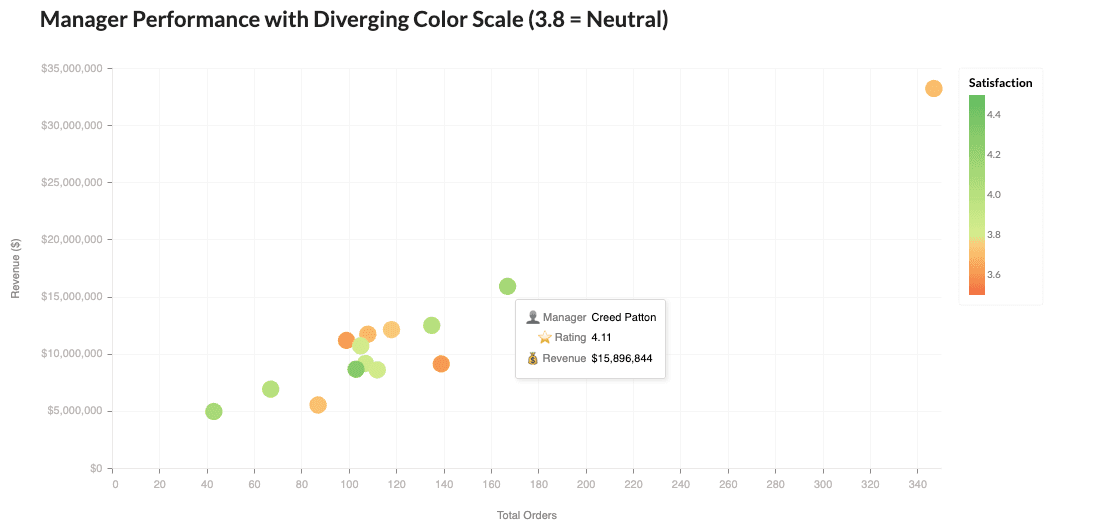
- "Show a heatmap with a diverging color scale centered on the average"
- "Use traffic light colors to indicate performance levels"
- "Make revenue green and costs red in the same chart"
Text Labels & Annotations
Add labels directly on your charts for extra clarity - no legend hunting required!

Example prompts:
- "Add value labels on top of each bar"
- "Label each point with the manager name instead of using a legend"
- "Show percentages inside each pie slice"
- "Put the exact dollar amounts on the chart"
Calculated Fields & Transforms
Create new metrics on the fly! Ratios, rankings, running totals - all computed in the visualization.

Example prompts:
- "Show revenue per order as a calculated metric"
- "Rank the managers and highlight the top 3"
- "Calculate the running total of revenue"
- "Show each manager's percentage of total revenue"
- "Create a chart with a profit margin calculation"
Customizing Axes & Legends
Fine-tune every visual element - axis labels, legend positioning, tick formatting, and more!
Example prompts:
- "Angle the x-axis labels at 45 degrees"
- "Put the legend at the bottom of the chart"
- "Format the y-axis as currency with no decimals"
- "Remove the axis title and grid lines"
- "Make the legend horizontal"
- "Use dashed grid lines"
Pro Tips for Better Visualizations
Be Specific About What You Want
| Instead of... | Try... |
|---|---|
| "Show me sales" | "Show me monthly revenue trends for 2025" |
| "Make a chart" | "Create a bar chart of top 10 products by order count" |
| "Compare things" | "Compare Q1 vs Q2 revenue by region using grouped bars" |
Specify Chart Types When You Have a Preference
- "...as a line chart"
- "...using a heatmap"
- "...show this as small multiples"
- "...create a stacked area chart"
Add Context for Richer Visualizations
- "...colored by category"
- "...sized by revenue"
- "...with a reference line at the average"
- "...sorted from highest to lowest"
Request Specific Styling When Needed
- "Use green for revenue and red for costs"
- "Make it a horizontal bar chart"
- "Add data labels to the bars"
- "Show values in millions"
Avoid pie charts when comparing more than 5 categories - use a bar chart instead for better readability.
Creative Possibilities
Altair's flexibility means you can ask for almost anything! Here's the key insight:
The more specific your prompt, the better the result.
Feature Categories You Can Request
| Category | What You Can Customize |
|---|---|
| Tooltips | Labels, formatting, emojis, calculated fields |
| Colors | Semantic (good/bad), diverging scales, custom palettes |
| Text | Value labels, point labels, annotations |
| Calculations | Ratios, rankings, running totals, percentages |
| Interactions | Legend filtering, brush selection, linked charts |
| Chart Types | Lollipop, radial, bullet, waterfall, slope |
| Axes | Label angles, formats, grid styles, titles |
| Legends | Position, orientation, size, title |
Pro Tips for Creative Requests
- Be specific about what you want to highlight - "Color the bars red if above average, green if below"
- Describe the story you want to tell - "Show how each manager contributes to the total"
- Reference the visual style - "Like a Bloomberg terminal chart" or "Clean and minimalist"
- Ask for interactivity by name - "Click to filter" or "Hover to see details"
- Specify number formats - "Show revenue as $X.XM" or "Percentages with 1 decimal"
The key is: if you can describe it, Querio can probably build it!