Visualizations
Learn how to create useful charts in Querio.
Querio uses visualizations to make data easier to compare and explain.
The best visualization requests are specific about what you want to compare, what should be on each axis, and how the data should be grouped.
Good visualization requests
| Good request | Why it works |
|---|---|
| "Bar chart of revenue by region, sorted descending" | Names the chart type, metric, grouping, and sort |
| "Line chart of monthly sales for the last 12 months" | Gives a metric, time grain, and timeframe |
| "Scatter plot of order value vs margin, colored by region" | Defines both axes and the color grouping |
| "Heatmap of orders by weekday and hour" | Gives a clear shape for the visualization |
What to specify
When creating a chart, include:
- Chart type: bar, line, scatter, heatmap, donut, histogram, or area
- Metric: the value you want to measure
- Grouping: the category or dimension to compare
- Timeframe: the date range or time grain
- Sorting: if the order matters
Chart Gallery
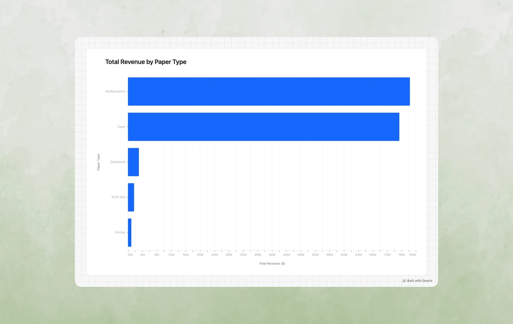
1. Bar Charts
Best for: Comparing values across categories, rankings, top N analysis
Example prompts:
- "Show me total revenue by paper type"
- "What are the top 10 products by sales?"
- "Compare order counts across regions"
- "Create a bar chart of average order value by account manager"
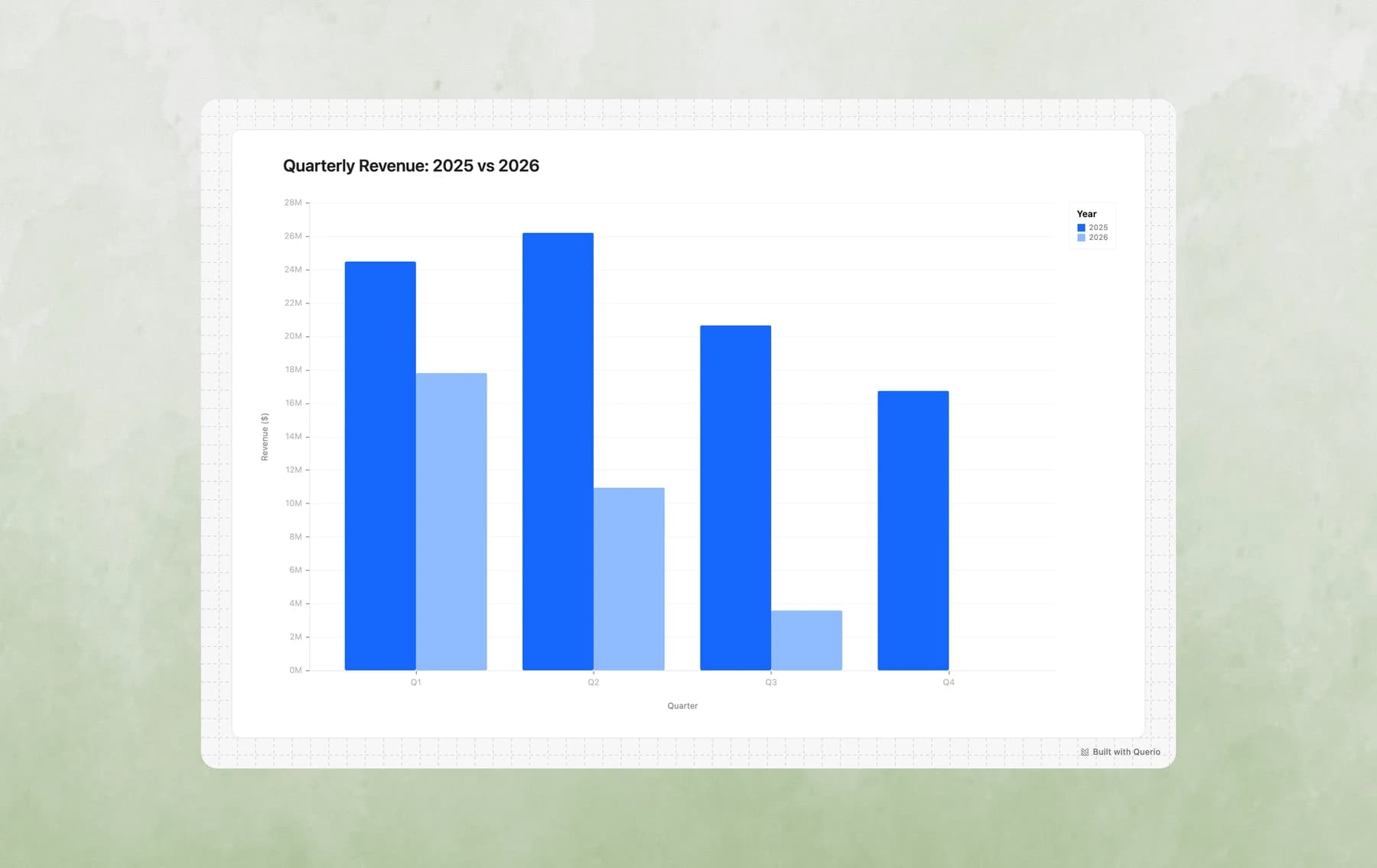
2. Grouped Bar Charts
Best for: Comparing multiple metrics side-by-side, year-over-year comparisons, A/B analysis
Example prompts:
- "Compare 2024 vs 2025 revenue by quarter"
- "Show completed vs cancelled orders by region"
- "Compare average order value and total orders by paper type side by side"
- "Create a grouped bar chart showing Q1-Q4 performance for each product category"
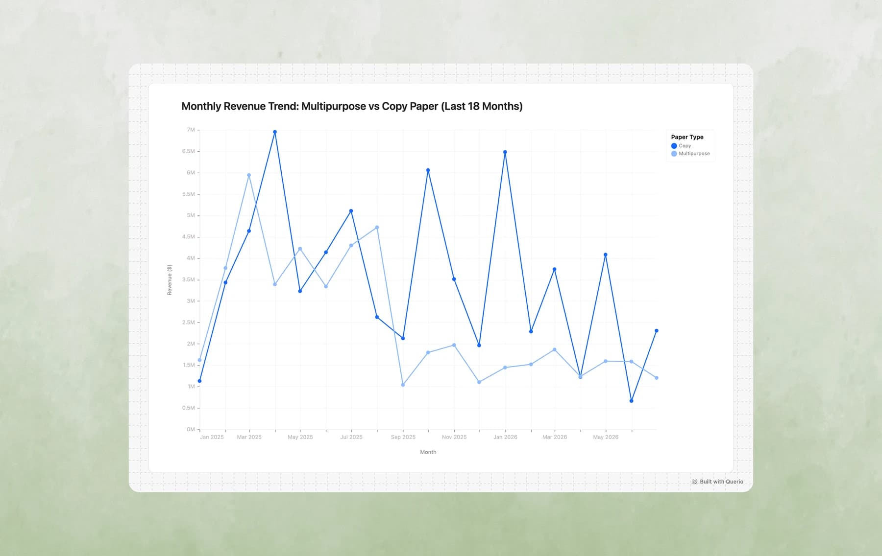
3. Line Charts
Best for: Trends over time, time series analysis, tracking changes
Example prompts:
- "Show me monthly revenue trends for the past year"
- "How has order volume changed over time?"
- "Plot daily sales for the last 30 days"
- "Create a line chart of average order value by week, broken down by shipping mode"
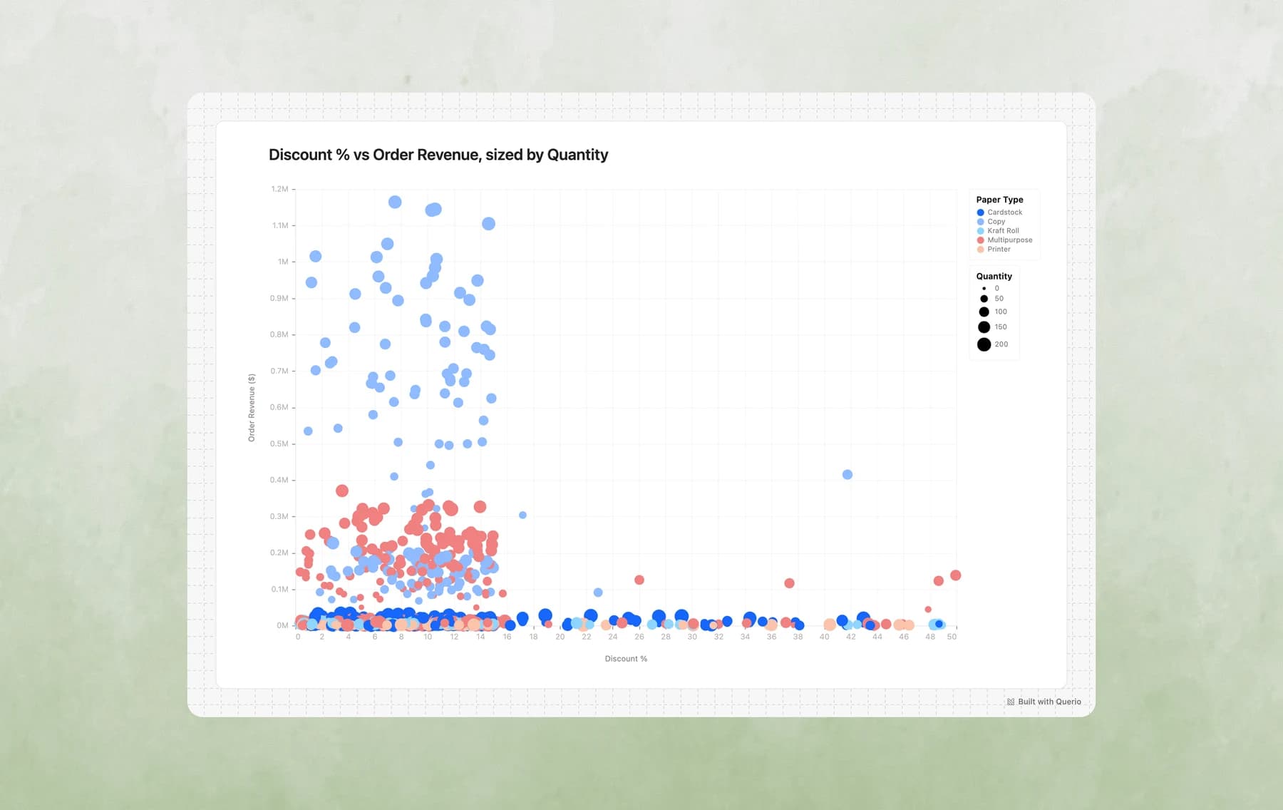
4. Scatter Plots
Best for: Exploring relationships between variables, identifying outliers, multi-dimensional analysis
Example prompts:
- "Is there a relationship between discount percentage and order size?"
- "Plot accounts by revenue vs order count, sized by business size"
- "Show me a scatter plot of days to ship vs customer rating"
- "Create a bubble chart of products by price vs quantity sold, colored by paper type"
5. Stacked Area Charts
Best for: Showing composition over time, part-to-whole trends, cumulative analysis
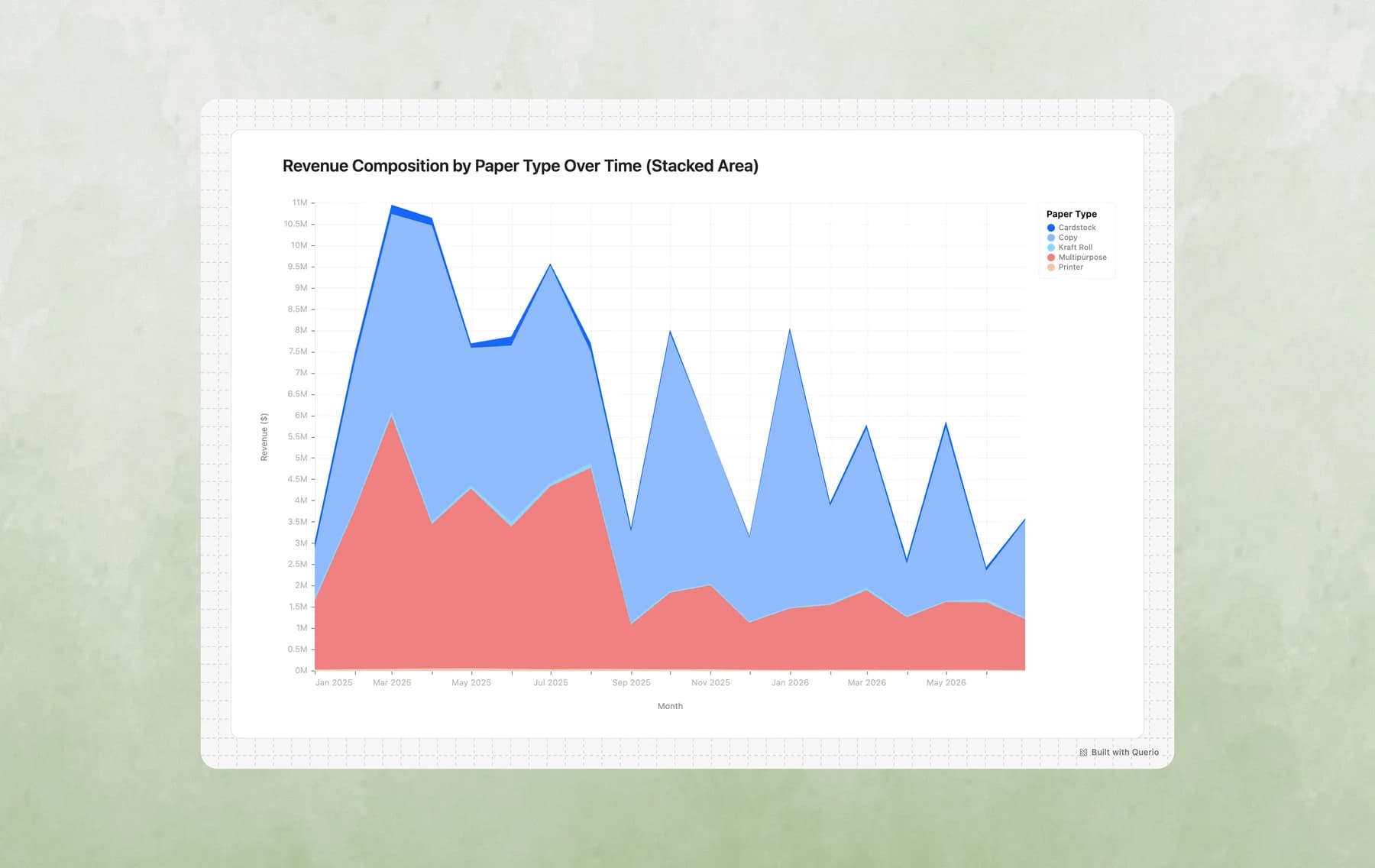
Example prompts:
- "Show how revenue composition by paper type has changed over time"
- "Create a stacked area chart of orders by status over the last 6 months"
- "Visualize regional revenue share trends"
- "How has the mix of shipping modes evolved month over month?"
6. Heatmaps
Best for: Two-dimensional categorical comparisons, finding patterns across two dimensions, density analysis
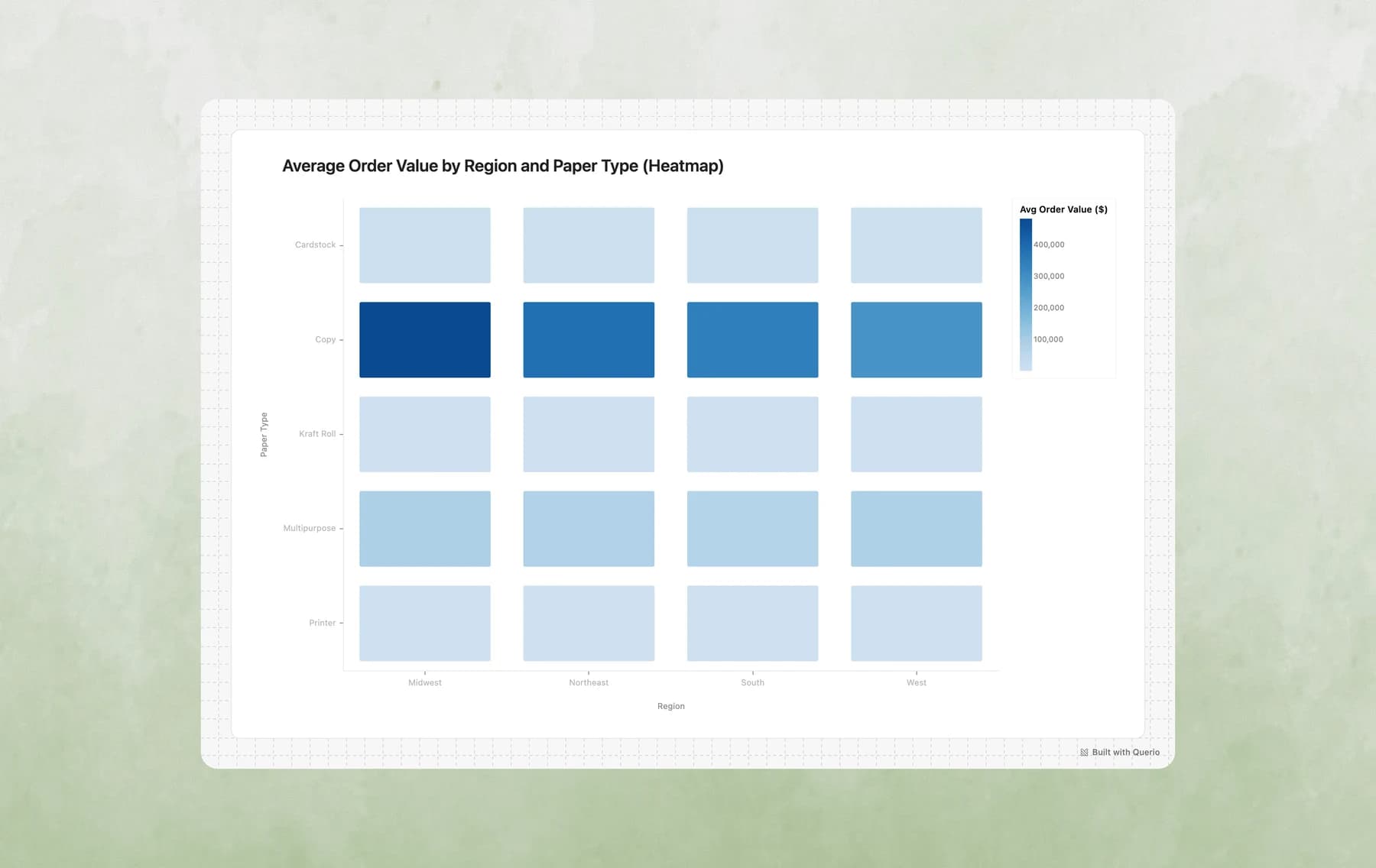
Example prompts:
- "Create a heatmap of average order value by region and paper type"
- "Show me order volume by day of week and hour"
- "Which account managers perform best in which regions? Show as a heatmap"
- "Visualize rating distribution by product category and shipping mode"
7. Layered Charts (Combo Charts)
Best for: Showing multiple related metrics together, adding context (targets, averages), combining different perspectives
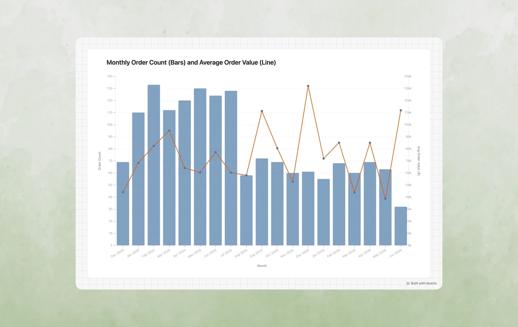
Example prompts:
- "Show monthly revenue as bars with a trend line overlay"
- "Create a chart with order volume bars and average order value as a line"
- "Plot revenue by month with a horizontal line showing the target"
- "Combine a bar chart of sales with a line showing cumulative total"
8. Faceted Charts (Small Multiples)
Best for: Comparing the same pattern across categories, side-by-side trend comparison, segmented analysis
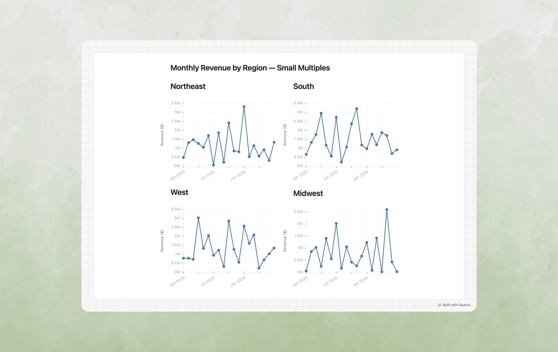
Example prompts:
- "Show monthly revenue trends, with a separate chart for each region"
- "Create small multiples of order volume by paper type"
- "Compare seasonal patterns across account managers using facets"
- "Show me weekly trends faceted by shipping mode"
9. Donut/Pie Charts
Best for: Part-to-whole relationships, market share, simple composition snapshots
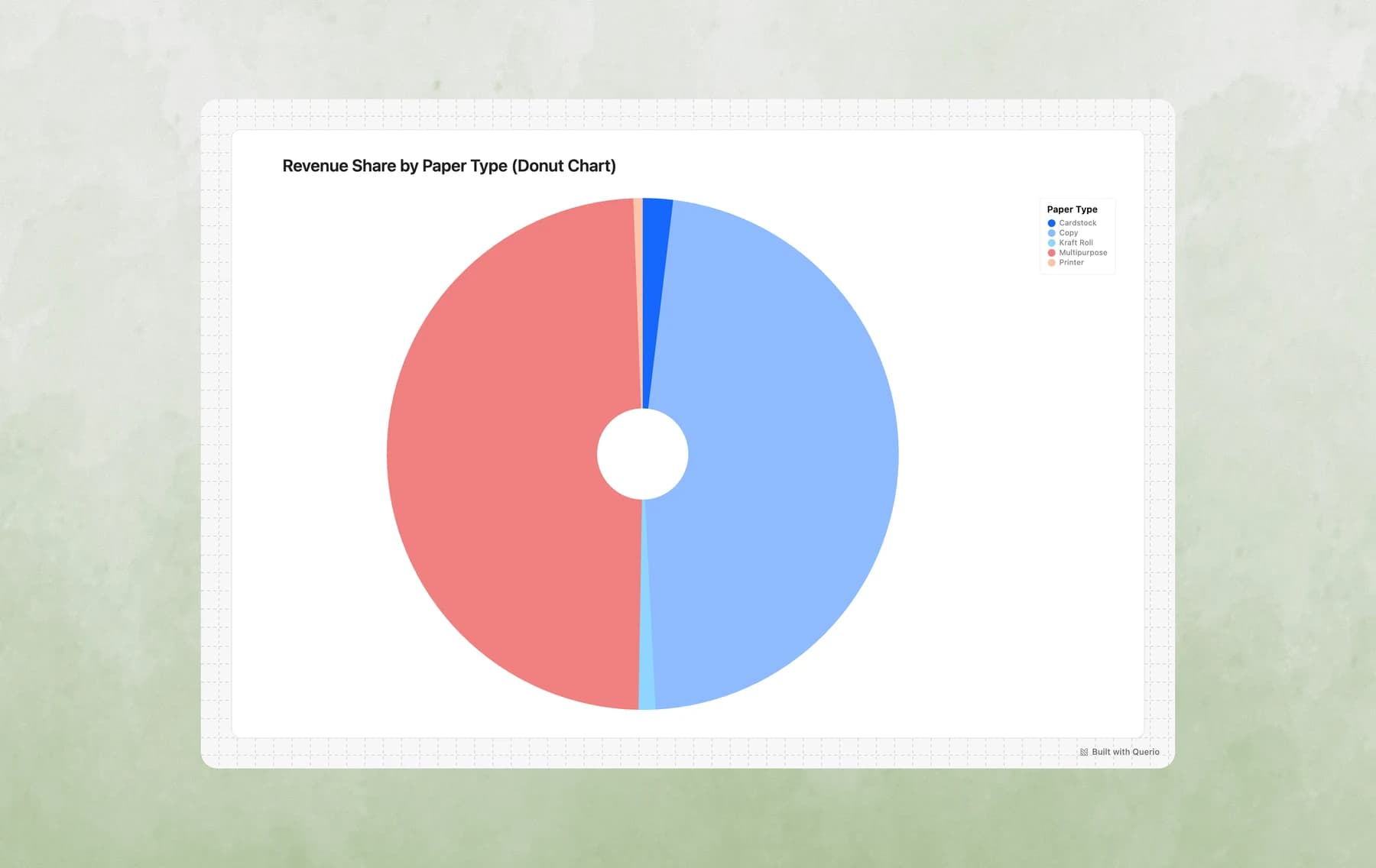
Example prompts:
- "What percentage of revenue comes from each paper type?"
- "Show the breakdown of orders by status as a pie chart"
- "Create a donut chart of revenue share by region"
- "What's the distribution of shipping modes?"
10. Histograms
Best for: Understanding distributions, identifying patterns in continuous data, finding outliers
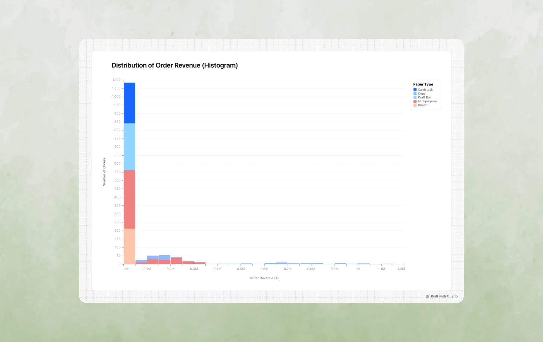
Example prompts:
- "What's the distribution of order values?"
- "Show me a histogram of days to ship"
- "How are customer ratings distributed?"
- "Create a histogram of discount percentages"
Advanced Customization
If the first chart is not right, send a follow-up. Querio can change the chart type, filters, labels, or grouping from the same explore.
Custom Tooltips
Tooltips aren't just for showing raw values - you can customize them with labels, formatting, and calculated fields!
Example prompts:
- "Create a scatter plot of revenue vs units sold, with detailed tooltips showing product name, rating, and discount"
- "Make a chart with emoji labels in the tooltips"
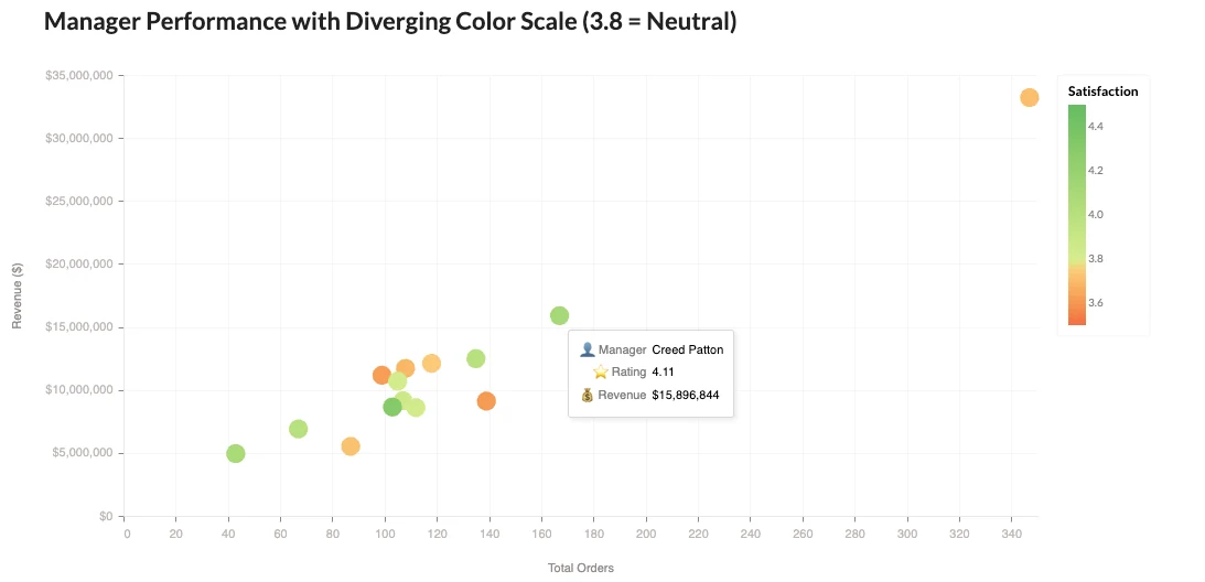
Custom Color Scales & Semantic Colors
Use colors that mean something! Red for bad, green for good, or custom gradients that tell a story.

Example prompts:
- "Create a bar chart where high cancellation rates are red and low ones are green"
- "Use traffic light colors to indicate performance levels"
Text Labels & Annotations
Add labels directly on your charts for extra clarity - no legend hunting required!

Example prompts:
- "Add value labels on top of each bar"
- "Show percentages inside each pie slice"
Calculated Fields & Transforms
Create new metrics on the fly! Ratios, rankings, running totals - all computed in the visualization.

Example prompts:
- "Show revenue per order as a calculated metric"
- "Calculate the running total of revenue"
Last updated on July 13, 2026